What’s the most important thing that you want your website visitors to do?
Comment on your blog post?
Buy specific products or services?
Enrol in your subscription plan?
Having a clear Call-To-Action (CTA) button is crucial in reaching that goal. But before your website visitors are convinced to make that purchase or click on anything, these are a few approaches you can make in making your website more attractive and transparent to earn their trust:
Colours can produce all kinds of emotions. Would you want to have such sentiment representing your website and brand? These are some general sensibilities that different colours evoke:
⬛️ Black and white: Symmetry, impartial, calm
🟨 Yellow: Sanguine, warmth, openness
🟧 Orange: Friendly, merry, self-assured
🟥 Red: Passion, fearless, youthful
🟪 Purple: Artistic, imaginative, thoughtful
🟦 Blue: Trust, reliability, robustness
🟩 Green: Serene, growth, well-being
Is your website only having one colour? Or multi-tones of colours? There is no right or wrong answer in painting your website, but generally, you’d want the harmony of colours to be present. This visuality imbues a sense of professionalism and connection between you, the web designer, and your website visitors.
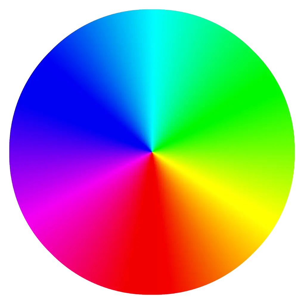
To do that, let's look at the colour wheel and the types of colour combination:
Complementary colours are two colours opposite each other in the colour wheel.
Monochromatic colours are two colours at the same position in the colour wheel but with a slight variance in luminance level (darker or lighter).
Analogous colours are three colours beside each other in the same quarter of the colour wheel.
Triadic colours are three colours evenly-spaced among each other in each one-third of the colour wheel.
Tetradic colours are four colours evenly-spaced among each other in each quarter of the colour wheel.
Found a colour that you like but don’t know what goes with it? Try the Canvas Colour Wheel and find out.
Once you have your colours ready, it is then time to manage the composition of your website. Understanding how your layout should be, like every other website, shall be catered based on its content. Take into account if you’d like to showcase the following components:
Media: pictures, videos, gallery, product, blog post
Words: descriptive, blog post, product description, articles, forum, the comment section
The components above shall determine how your website should be read or approached. There are generally two types of reading pattern which you can consider in determining the layout of your website:
This eye-screening methodology is when website visitors start at the top left corner of the web page, and they will scan vertically downwards through the content. If they find anything to their interest, their focus will move horizontally like an F-shape. This website viewing is usually on websites with a high density of words or lists of items, such as blogs, articles, search results, media galleries or product galleries.
Youtube is a site that lists the vast libraries of videos, and the F-shape layout works better for visitors to browse through.
Most of the time, this design has a sidebar or two. You can incorporate various elements in an F-shape arrangement such as:
Cards consist of pictures, videos or short descriptions. When someone wants to learn more about the specific post, such as a picture or a video, they can click on the individual card to view it in detail.
Magazine layouts also are arranged in a grid. However, they differ in that they have a headline or a huge title above the numerous thumbnails of posts or articles. The media aspect, such as pictures or videos, also tends to be less accentuated than its wordings.
On the other hand, the Z-shape layout is for sites with a focus or an intended CTA. As the shape of the letter ‘Z’, the readers shall start at the top left, move horizontally to the right, then towards the bottom left and to the horizontal right before scrolling down.
MailChimp has an intended CTA by designing its homepage to illustrate its focus.
This arrangement of empty spaces, words, pictures and curated visuals keep visitors engaged with less content. They can read more naturally and, hopefully, proceed to your designated CTA. Arrangements regularly used in a Z shape layout are:
There is a 50:50 screen split of contrasting elements used. It is applied when making comparisons or listing two different products or services. When given a choice, visitors may engage even more by reacting to their preference.
Just as the name suggests, asymmetrical is the division of two contrasting screens, but of different ratio. The dissimilarity of screen length may prove to provide more engagement as it lays a heightened sense of depth, or suggests a directional movement towards a CTA button.
Rather than dividing the screen, you can also opt to display only one image filling up the whole screen with strategic negative spaces to bring a bokeh of depth and focus. Or one clear photo with intricate details.
Illustration or drawn elements can be used as the simple yet elegant choice, depending on your niche. For example, it is easier, faster, (and less expensive) to show a cartoon character demonstrate certain things than to have live models do the same thing.
The single-column is a layout that is crucial in the year 2021. With the rise of mobile phones, browsing the net has caused the web page to appear in a mobile-optimized screen.Single column is easily viewed on a mobile device
It means that all the sidebars and some elements of the F and Z shape layouts become obsolete as it turns to a single column. Traditionally used in a single page blog post, almost everything now, can be arranged in a single column such as news articles, videos, and timeline posts.
Serif fonts have a decorative stroke at the end of each letter. It gives a more classical feel yet keeping it easy-to-read. Traditionally used fonts are like Times New Roman and Georgia.
Sans, in French, means ‘without’. Or without that decorative end stroke at each Sans Serif letter. It delivers a contemporary and clean vibe if your website has that overall theme. Popular Sans Serif fonts (you might have heard of) are Arial, Tahoma, Verdana, Futura, and Helvetica.
Some trending Sans Serif Google Fonts under the Open Font License are:
The easiest way to pair fonts is by using Google Fonts and based on the font chosen, click on the ‘Pairings’ tab to see some of its popular pairings. Choose which is suitable for you.
Fraunces is pairable with Montserrat.
You can even view the resulting sample paragraph at the side. Choose and pair your favourite fonts to make your website looks stunning!
When someone visits your website, where do you want them to go after your landing page? Typically, it is advisable to provide the route to other pages that you have via the menu. A menu can be in various creative formats and design. Generally, you can put the navigation menu:
Top Menu Layouts are the traditional way to create a navigation menu. It can be fixed/sticky, or it can disappear as you scroll down, or it can appear again when you scroll up.
Mega Menus are menu in a menu. When you click or hover the cursor on a link in the navigation menu, a new menu pops up. This trait is exceptionally beneficial for sites with an array of pages while keeping them organized.
The Side Menu style rises in fame with the use of viewing websites on mobile devices. Typically appearing as a hamburger button (three lines at the top left/right), you would click on it to view the navigation. This feature provides a cleaner feel as the menu is tucked away and is easily accessible by clicking on it again. In the desktop view, a side menu can also be in a fixed position. Website visitors then can go to their desired page at a single click.
Opposite to the top menu, this navigation style places the menu at the bottom of the screen. Even though the user interface looks different, its functionality and feel are almost the same as a top menu bar.
The difference is, however, noticeable in the sticky footer navigation bar on mobile websites or apps. The menu, located closer to the fingers when holding a mobile device, provides more comfortable navigation.
Many modern websites and apps are utilizing the sticky footer navigation bar.
Space, or negative space, is the space that is intentionally left blank in a website to avoid feeling too cluttered. Here are a few pointers on using space:
Allow your website visitors to skim through your content, and(Did you stop?)when they see something that is attracting them.
Spaces make the products or services look more indulging as the negative space provides that shift in focus.
Negative spaces don’t have to be white. It can be patterns, gradients, colours or bokeh.
Take a look at how Apple uses negative space to accentuate its product
To design your website, first, pick a theme to identify you or your company. Stick towards this theme in choosing your layouts, fonts, colours, and navigation style when generating your content. Be consistent in your choice as it will represent you and your website when you are trying to improve your SEO. The harmony that you have created will provide a positive impression on your website visitors. And hopefully, will translate to a higher conversion rate. Lastly, have fun and enjoy creating your website!
We use cookies to improve your experience on our site and to show you relevant advertising.


")
